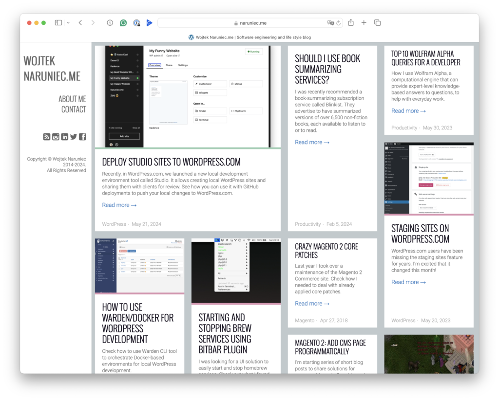
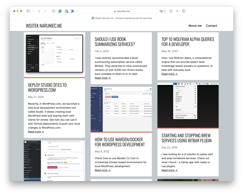
I enjoyed using the Ubergrid theme for many years, with its characteristic masonry home page layout. However, as the theme authors never upgraded it to a block theme, I thought it was time to change it.
I like the masonry layout and wanted to keep it if possible. However, I couldn’t find a simple block theme or custom block that would allow me to set up such a layout. The only solutions I found were full-featured, massive plugins, where masonry layout was only a small part of the offered solution. I decided to customize the default Twenty Twenty-Four theme to match the look and feel of the old theme and try to achieve a masonry layout look.
Requirements
My requirements were simple:
- Use default block theme
- Customize it to match the old theme look and feel
- Keep the masonry layout
- Avoid using custom JavaScript if possible
Steps
Roughly, I did the following:
- Download the Jetpack backup of my site
- Import it to the Studio site
- Install the Twenty Twenty-Four theme and activate it
- Clean up the homepage template from existing sample blocks
- Copy the WordPress.com Pattern that was closest to the tiled three-column post list
- Add a custom font, change colors, spacing, and sizes to match the old site
- Make the block grid closer to the masonry layout
- Upload Twenty Twenty-Four and my small masonry plugin to my site
Compare
See how the old and new themes compare. The new one keeps the look and feel, but the masonry effect is more spartan.


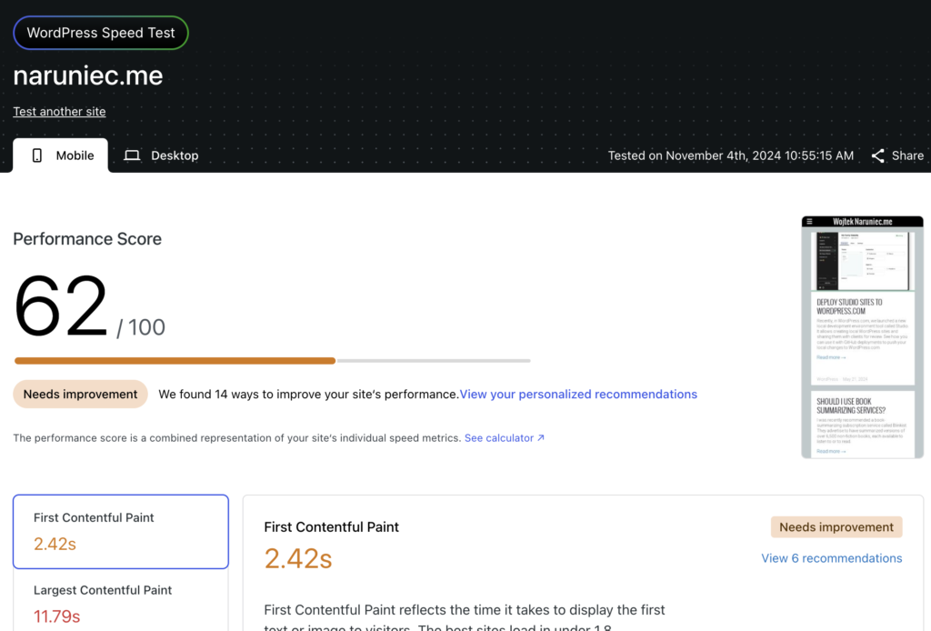
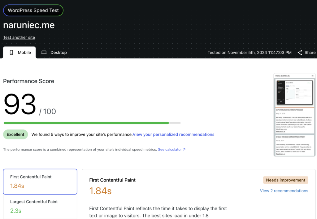
But see how the speed test score changed!


Challenges
In general, the whole process was smooth and easy. Two steps were most challenging: customizing block spacing and backgrounds to my needs and setting up the masonry layout. I needed to fix some server issues, too, as I found out that Gutenberg didn’t load at all due to incorrect font permissions and the OPTIONS method not being enabled on the server.
Spacing
I didn’t expect that configuring blocks’ backgrounds and spacing would be challenging. I couldn’t figure out from which block the observed spacing comes and whether it is padding, margin, or spacing. Also, in some cases, the block had a spacing in the front end but not in the editor settings. I needed to move the slider up and down to reset it.
Eventually, I figured out the right way. I needed to wrap the main content of pages like posts, pages, or 404 with a Group block. Then, I set a grey background for the parent block and a white background for the child block, along with fixed padding for the child elements. The remaining part was adjusting padding for child elements.
The only downside is that the post in the editor doesn’t have any margins now. I can figure it out later.
Masonry
There is no easy way to set up a grid using CSS to achieve the masonry look. I reviewed different solutions:
- Low tech way, which is just about organizing blocks in columns and not rows
- Use JavaScript library
- Use core CSS feature
I didn’t want to organize posts in columns, as it resulted in weird ordering—the posts would be ordered in one column, then the next one, and then the third one. I wanted to avoid JS for the sake of simplicity. There is a proposal to add a masonry option to CSS flex layout, but it is not supported by any browsers yet.
Hopefully, I found a nice CSS-only solution that resorts block using nth-child selectors. I used this solution primarily as is but asked Studio Assistant to write a small plugin to keep and load that code using a custom CSS class name. It seems to work fine. The only downside of this solution is that it requires setting a fixed height for the parent container, but I can live with that for now.
I will switch to the new core CSS solution when it is supported by major browsers. When it does, we may also see that added to Gutenberg.
Summary
I’m happy with the final effect. I just miss the ability to choose different block sizes from the previous theme. When I used various sizes, the layout looked more appealing, and blocks were resorted when the browser was resized instead of changing the width responsively. I may look into this at some point, though.
What do you think about the change?
Leave a Reply